
Gardaí are appealing for witnesses following a road traffic collision
Search
07 Mar 2026
Please allow ads as they help fund our trusted local news content.
Kindly add us to your ad blocker whitelist.
If you want further access to Ireland's best local journalism, consider contributing and/or subscribing to our free daily Newsletter .
Support our mission and join our community now.
To continue reading this article, you can subscribe for as little as €0.50 per week which will also give you access to all of our premium content and archived articles!
Alternatively, you can pay €0.50 per article, capped at €1 per day.
Thank you for supporting Ireland's best local journalism!


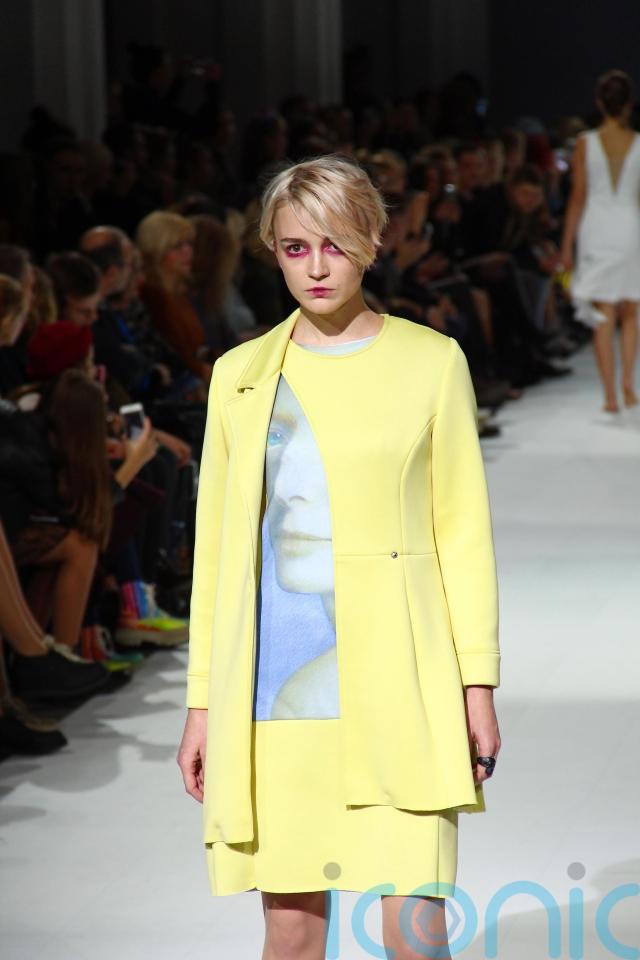
Cobalt blue, fiery red and Pantone’s Cloud Dancer white are just a few shades set to dominate 2026 wardrobes.
But as I learnt with 2025’s butter yellow, while a colour may be trending, it doesn’t automatically mean it will suit you.
As we leave the creams and taupes of “quiet luxury” behind and lean back into bolder palettes, more people are asking what actually works. That question has brought colour analysis back into the mainstream – not as an Eighties novelty, but as a tool for shopping with fewer mistakes.
Once associated with department store counters and style manuals, colour analysis has been revived by TikTok and the wider “buy less, buy better” movement. So, rather than asking whether a shade is in, people are increasingly asking whether it’s right for them. That’s where colour analysis comes in.
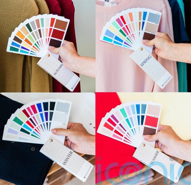
The process
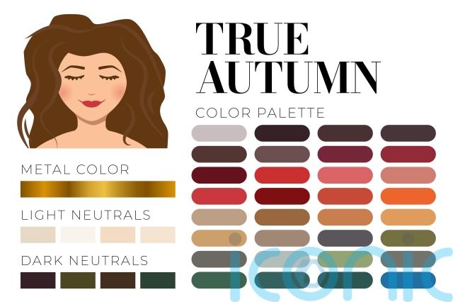
“The first thing we work out is are you warm? Are you cool?” says colour analyst Michelle Marks, one of House of Colour’s many consultants in the UK. “Once we know, then we go between the two seasons, winter and summer are cool, autumn and spring are warm.
“[Autumn and spring] have got like a wash of yellow mixed into them. So even these blues and greens and greys, they’ve got more yellow mixed into them than the blues.”
From there, contrast determines the season.
“So the difference between winter and summer is that winter is bright and sharp and very high contrast, and the edges are really crisp and distinct, then summer is much more kind of soft and tonal and blended.
“So you could be cool and sharp, or you could be cool and soft – or with spring – warm and sharp, even though these ones are light at the edges are really crisp with it, or autumn, you can be warm and soft.”
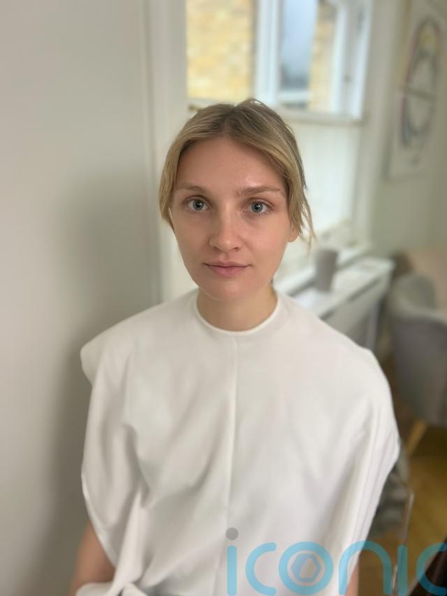
Before heading in, I assumed I’d be a summer. Light-skinned and mousey blonde, I had always thought I was cool-toned, leaning towards grey, navy, soft blue and blush.
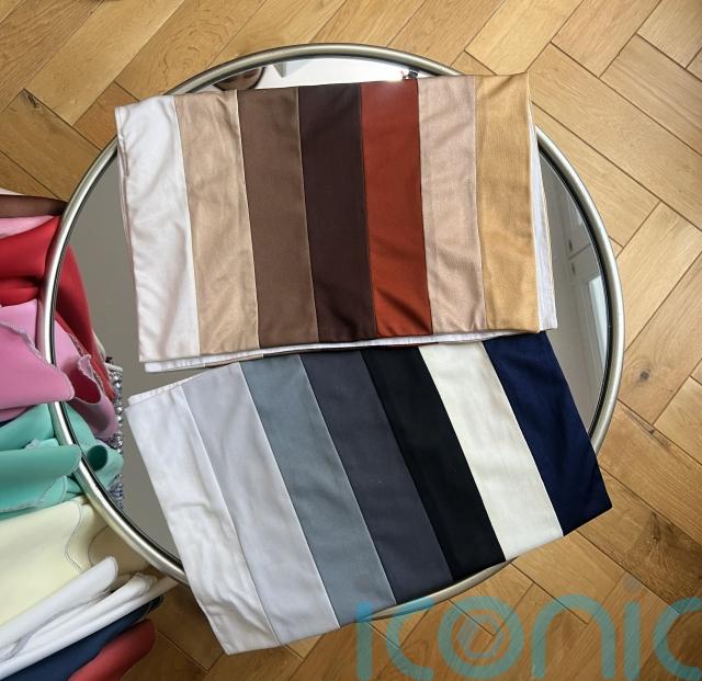
The assessment is visual rather than theoretical. Fabrics are draped beneath the face: a warm green against a cool green, optic white beside cream.
Michelle explains what she looks for. “If you look at [your] jawline there, are you more defined and more in focus? Or does it melt into your neck? [If it’s the latter] that means that colour washes you out.
“Do colours bring out blue undertones of your skin?” she asks. If they do, undereye shadows appear more pronounced and the face looks duller.
Even professionals are not immune to surprise. “I wanted to be anything but a winter and I was very upset,” says Michelle. “But now I can’t see me wearing soft, warm colours at all.”
How to translate trends for your season
What makes colour analysis newly relevant is how it interacts with trends. Instead of dictating what to wear, it acts as a filter. The question shifts from: Is cobalt in? to: Is cobalt in my season?
In a year defined by bold forecasts, that reframing is powerful. It means you can participate in colour without being led by it. You don’t have to ignore trends – you just adapt them.
A winter might lean into true cobalt, whereas a summer could opt for a more muted periwinkle version. The trend remains; the undertone changes.
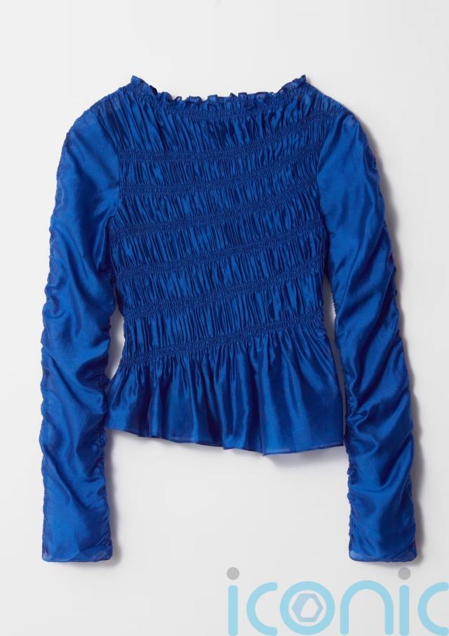
And Other Stories Cobalt Blue Smocked Top, £39 (was £77)
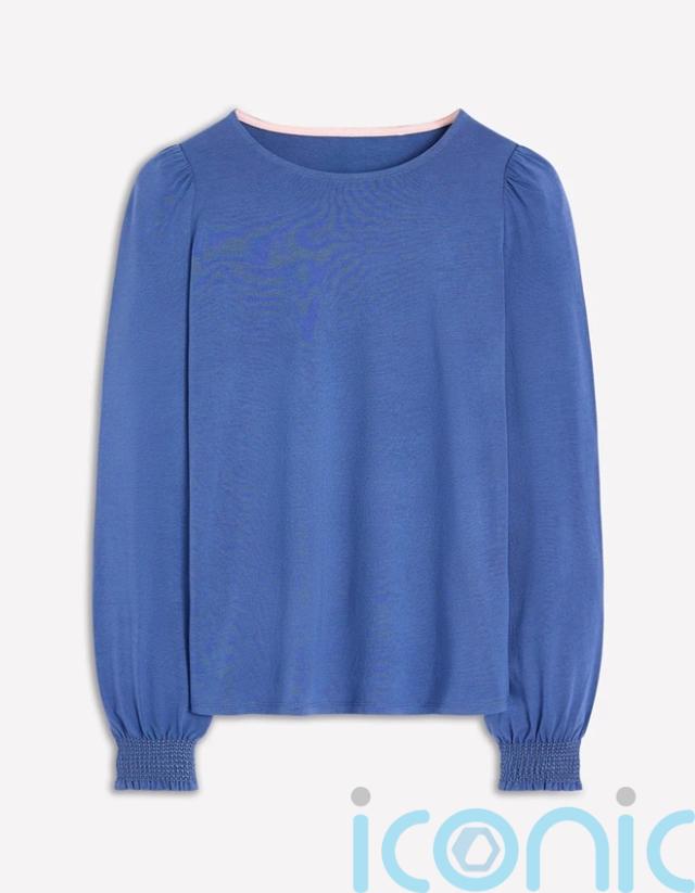
Boden Denim Blue Smocked Cuff Supersoft Top, £27.30 (was £39)
Does timing matter?
Like many people, I assumed some colours only worked on me in summer. Michelle says that’s a myth.
“It makes no difference [whether you’re tanned or not] when getting your colours done,” she says, “as long as you’ve not put fake tan on, because it’s a bit harder to see, but it makes no difference, you’ll have the same season no matter what.”
What does change is emphasis. Some colours in your palette will feel better in summer, others in winter. In autumn, for example, khaki and tan often feel right in colder months, while coral and cream come into their own in summer.
Hair colour and jewellery, however, can complicate things.
“It can be difficult to tell, when people dye their hair a funny colour, it can look striking, but it doesn’t necessarily look flattering.
“And I think that can happen with with with jewellery as well. Sometimes things can stand out, but it doesn’t mean it’s your perfect fit.”
That distinction between striking and harmonious is key in a year heavy on trending colours.
Even neutrals are not universal. White, in particular, is rarely one-size-fits-all.
“So with white, cool-toned would be much sharper Optic White, and then a warm would be more ivory or cream.
“You’re a cream, as long as you’ve got warmth in there that’s great, but optic white just cuts you at the neck, it doesn’t look harmonious.”
Michelle was right. The warmer shades undoubtedly made my skin look healthier and my eyes brighter.
Once a season is identified, the palette is organised into three tiers: significant colours for accents, excellent colours for individual pieces and wow colours you can wear head-to-toe.
“So these are your colours,” she said, holding out an array of greens, pinks, oranges and browns.
“You can’t do navy – teal is your navy,” she said. “Brown is your grey and chocolate is your black. Amber, saffron, coral and khaki are your wow colours.”
It shocked me. I’d always thought orange washed me out. But it also reframed trends – cobalt becomes ultramarine; Cloud Dancer becomes cream.
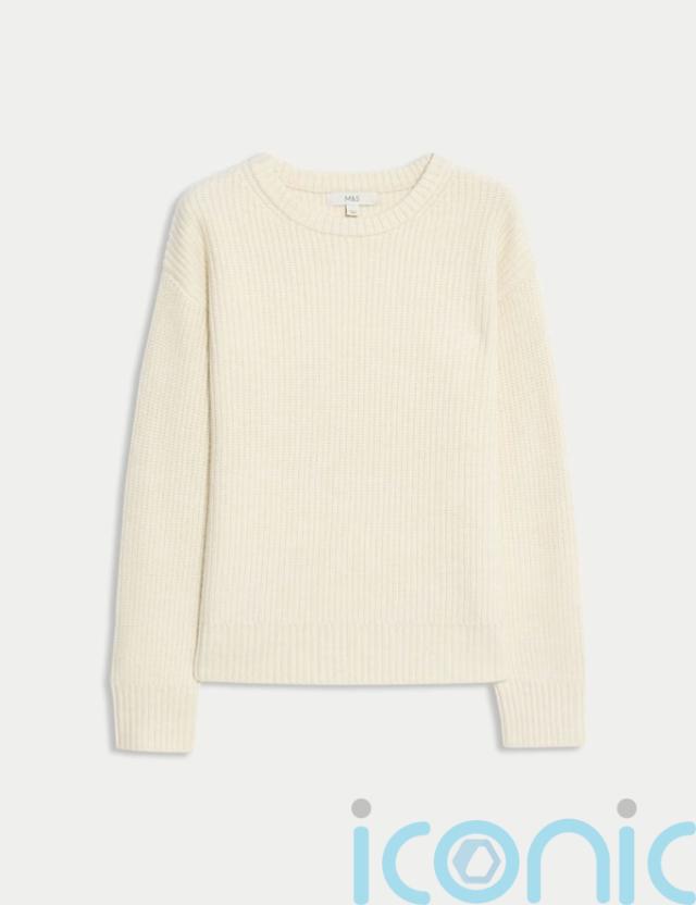
M&S Cream Cloud-Yarn Ribbed Crew Neck Jumper, £26
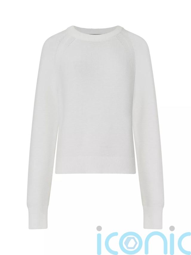
French Connection Lilly Mozart Crew Neck Jumper, Summer White, £40, John Lewis
Takeaways
Colour analysis doesn’t mean there are some colour trends you can follow and some you can’t – it translates them. Instead of chasing every shade, you swap it for your version.
An in a year where fashion is shifting from quiet luxury to ‘loud luxury’, it offers a way to participate without wasting money.

Subscribe or register today to discover more from DonegalLive.ie
Buy the e-paper of the Donegal Democrat, Donegal People's Press, Donegal Post and Inish Times here for instant access to Donegal's premier news titles.
Keep up with the latest news from Donegal with our daily newsletter featuring the most important stories of the day delivered to your inbox every evening at 5pm.
This publication supports the work of the Press Council of Ireland and Office of the Press Ombudsman, and our staff operate within the Code of Practice of the Press Council. You can obtain a copy of the Code, or contact the Council, at www.presscouncil.ie, Lo-call 1800 208 080 or email: info@presscouncil.ie.


