

How to style Pantone’s 2023 Colour of the Year – Viva Magenta
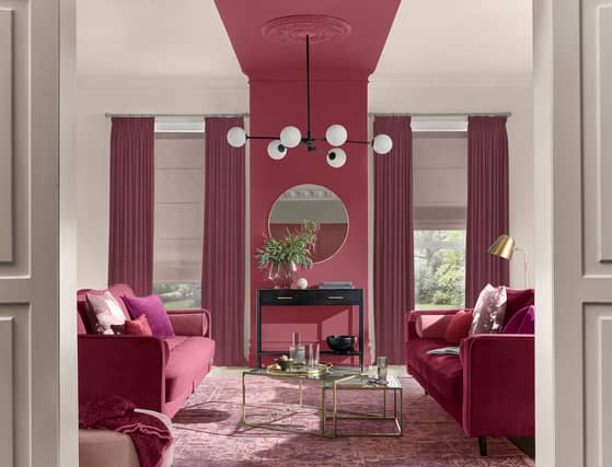

The Pantone Colour Institute experts have chosen ‘an unconventional shade for an unconventional time’ for 2023’s Colour of the Year – and Viva Magenta is certainly far from muted.
In fact, ‘brave, fearless, powerful and empowering’ is how this nuanced crimson-blended shade is described – ‘an animated red that revels in pure joy, encouraging experimentation and self-expression without restraint’.
According to the Pantone pros, this ‘electrifying’ and ‘boundless’ shade manifests as a ‘stand-out statement’ – and we’ve no doubt it’ll do the same for your interiors.
“Vibrant and energising, Viva Magenta is the perfect accent colour to liven up a room,” says Chelsea Clark, head of brand at Lust Home.
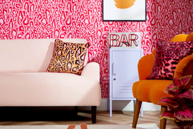
As Clark points out, the thought of using a bright or vibrant shade when decorating can be quite daunting at first, especially if it’s a break from the norm for you. After all, big aspirations call for confidence – but you can skip the expected curtains and scatter cushions pairing (depending on your budget) by switching up your wall treatments.
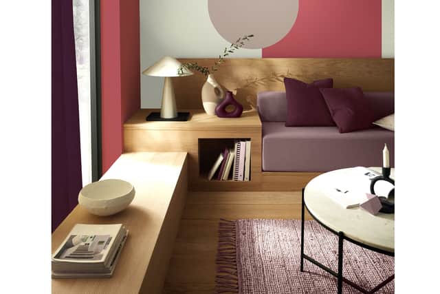
Elsewhere, colourful paint effects can help you pull off a major wall statement and take your blank canvas to the next level.
“Vixen is Graham & Brown’s take on Viva Magenta,” says James Greenwood, interior expert at Graham & Brown. A bold pink perfect for those who love playful colour, he acknowledges this vibrant hue can often seem quite overwhelming when introducing it to the home – but you don’t have to go all in at once.
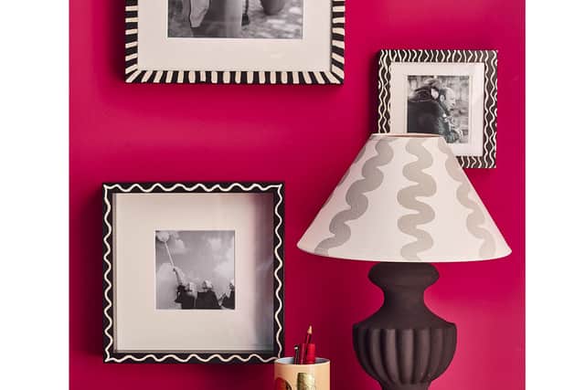
Think about pairing with cooler pink and purple shades, underpinned by a warm neutral like a putty beige, he suggests, which keeps the brighter pops of colour grounded.
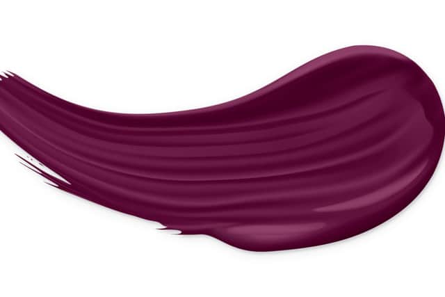
Indeed, Pantone cite Viva Magenta as ‘a shade rooted in nature descending from the red family – and expressive of a new signal of strength’. How you choose to channel this in your own home is open to interpretation.
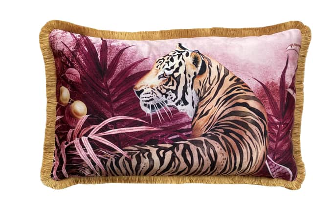
Play around with different depths of saturation and tones to see what works for your space. With a deep pinky-mauve sophistication, Bestley says these shades can wrap you in warmth and comfort, like cashmere.
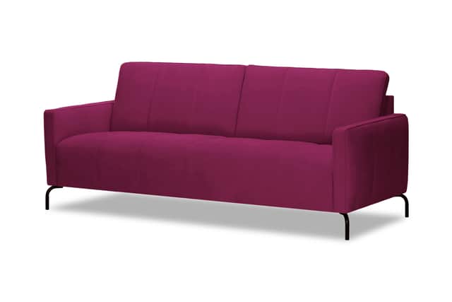
Another way to get the look is by focusing on upholstery and soft furnishings and having some fun with fabrics.
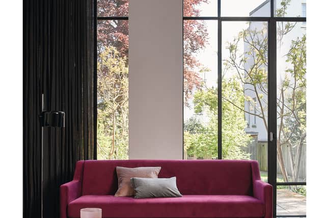
“Echo the colour around the space with your accessories, from your throw cushions to your rug,” she adds.
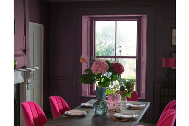
Best of all – with Pantone describing Viva Magenta as a ‘pulsating red shade whose exuberance promotes optimism and joy’ – think of all the spectacular ways you can work this joyous shade into your scheme when spring flowers start to bloom.
With peony flowered tulips turning heads, this red-pink hue will be cropping up everywhere.